Back to blog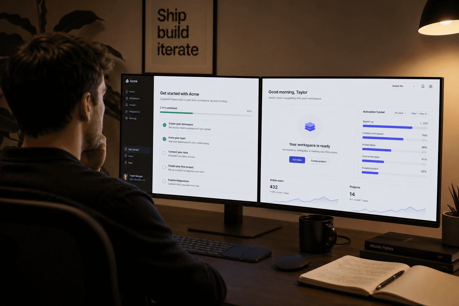
First-five-minutes activation checklist for B2B SaaS MVPs
12 min read
Activation UX: designing the first five minutes of a SaaS product
A practical activation checklist for B2B SaaS MVPs: map signup to first value, design empty states and sample data, skip bloated tours, and define the one action that proves your product works.
Signup is not activation
Most SaaS teams celebrate when signup conversion improves. Signup is a door, not a destination. Activation is the moment a new user believes the product might solve their job—and that belief usually forms in the first five minutes, not the first five days.
Activation UX is everything between account created and first value delivered. For a project tool, value might mean creating a task and marking it done. For analytics software, it might mean connecting one data source and seeing a chart populate. For a vertical B2B tool, it might mean completing the record type your buyer cares about. If you cannot name that moment in one sentence, you are not ready to design onboarding—you are ready to clarify the job.
The first five minutes matter because attention and patience are scarce. A motivated evaluator opened your app between meetings. A teammate clicked an invite link while multitasking. A founder testing competitors will abandon at the first dead end. Every extra screen that does not move them toward proof costs you learning and revenue. Investors notice when demos break on obvious paths; early customers notice when the product feels empty after signup.
Teams confuse activation with education. Education explains how the product works. Activation gets the user to a result they care about. You need both, but education belongs in empty states, tooltips, and optional help—not in a mandatory tour that blocks the screen before anyone touches the core object.
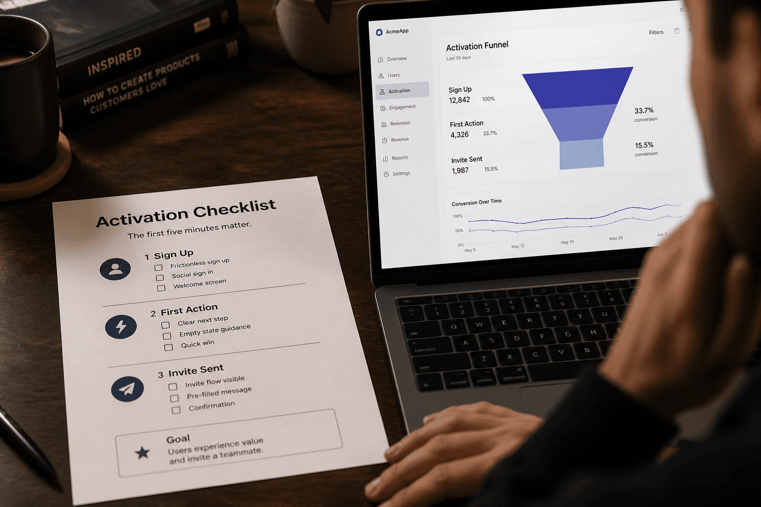
Measure activation as a funnel, not a vibe. Define the steps: account created, workspace or profile set, first core object created, first core action completed, optional invite sent. Track drop-off at each step. Design work should target the steepest cliff first. Adding features to settings rarely fixes a signup flow where users land on a blank dashboard with no next step.
This post maps signup to first value with a concrete checklist: empty states, sample data, skippable coaching, and the one action that proves the product works. The patterns apply to B2B SaaS MVPs where you cannot afford a white-glove onboarding team for every trial.
Map signup to first value in four steps
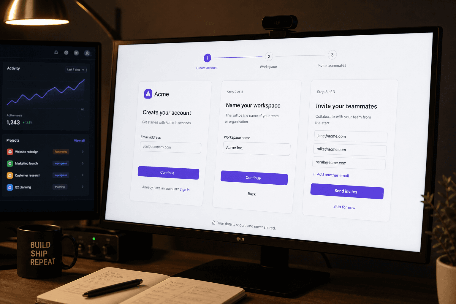
Start by drawing a linear path on one page. Not every user will follow it exactly, but the default experience should. For most B2B MVPs, four steps cover the first five minutes: create account, name the workspace, create the first object, complete the job once.
Step one is account creation. Keep fields minimal: email, password, or OAuth. Defer company size, phone number, and marketing questions unless compliance requires them. Every field you add before first value is a tax on activation. If you need profile data for sales, collect it after the user has seen the product work—or in a dismissible sidebar prompt.
Step two is context. B2B products usually need a workspace, team, or organization name. One field, one screen, obvious primary button. Explain why in one line: "This is what your team will see." Avoid multi-step wizards that ask for industry, role, and goals before showing the product. Those questions belong in analytics segments, not blockers.
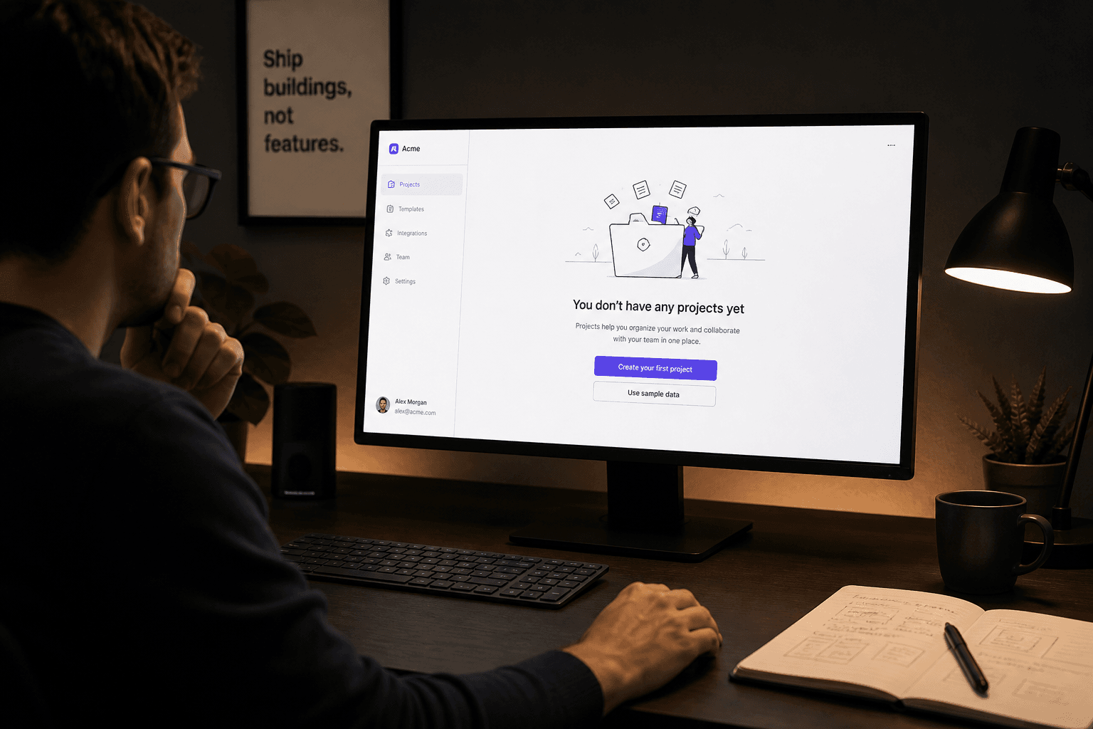
Step three is the first object. This is where MVPs fail most often. Users land on an empty dashboard with navigation chrome and no instruction. Design an empty state that names the object and offers a single primary action: Create project, Add contact, Connect source, Upload file. Secondary action can be "See sample data" if you offer it.
Step four is proof. The user must complete the core job once—not configure preferences, not invite the whole company. Proof means the workflow you sell in marketing actually ran inside the product. If your landing page says "assign tasks in seconds," activation is assign and complete one task, not browse settings.
The table below is a template you can copy into your brief. Replace object names and actions with your product language. Use it in design reviews when someone asks for "just one more onboarding question."
| Step | User sees | Success signal | Common mistake |
|---|---|---|---|
| Account | Email or OAuth, minimal fields | Account created, session started | Long forms, captcha friction, no SSO when buyers expect it |
| Context | Workspace or team name | Named space exists | Industry survey before product access |
| First object | Empty state with one primary CTA | Core record or item exists | Blank dashboard with no next step |
| Proof action | Happy path for one job | Core workflow completed once | Settings tour instead of doing the job |
| Optional expand | Invite, import, integrate | Second user or data connected | Forcing invite before solo value is proven |
Empty states that teach instead of dead-end
An empty state is not a placeholder. It is the most important screen in your MVP because every new user sees it first. Good empty states answer three questions: what belongs here, why it matters, and what to do next. Bad empty states show an icon and the words "No data yet."
Write headlines as outcomes, not container names. "No projects" is accurate and useless. "Create your first project to assign work to your team" tells the user what the product is for. Pair the headline with one primary button and optional secondary help. Do not offer three equal buttons—users hesitate when choices look equivalent.
Use empty states to set vocabulary. If your product calls work items "requests" internally but users think in "tickets," the empty state is where you align language with the buyer's mental model. Consistency here reduces support tickets later.
Design loading and permission empty states at the same time as the happy empty. If data takes two seconds to fetch, show a skeleton that matches the final layout—not a spinner in the center of a white page. If the user lacks permission to create objects, explain who can and offer a clear next step: request access, contact admin, or switch workspace.
Avoid illustration overload. One simple visual or none is fine for B2B tools. Founders sometimes commission custom art for empty states while the create flow still has a validation bug. Polish the path first; decorate after activation metrics move.
Test empty states with five strangers. Ask them to click once after signup. If they ask "what am I supposed to do here," the empty state failed regardless of how good the illustration looks. Record where they click. Fix that screen before adding a product tour on top of confusion.
Sample data beats blank canvases
Blank products feel broken. Sample data—or a guided first object—shows structure without asking the user to invent content from nothing. Not every product needs a full demo dataset. Even one pre-filled example row teaches more than an empty table.
Offer sample data as an explicit choice at the empty state: "Start with example project" versus "Create from scratch." Power users choose scratch; evaluators choose example. Do not hide sample data in documentation. Put it on the screen where the user stalls.
Keep sample data honest. Label it clearly: "Example — delete anytime." Use realistic but generic names. Avoid fake customer logos or metrics that look like social proof you do not have. The goal is comprehension, not deception.
For collaborative B2B tools, sample data can include a fake teammate or comment thread so invite flows make sense later. Solo value still comes first—show one person completing the job before emphasizing multi-user features.
When sample data is too heavy for engineering in v1, use a lightweight template. Pre-fill title and description fields on the create form. Open the create modal with sensible defaults instead of empty inputs. Templates are sample data with less backend work.
Remove or replace sample content when the user creates real data. Auto-archive the example project once they create their own, or move it to a "Getting started" section. Stale sample rows mixed with production data confuse dashboards and pollute analytics.
Measure whether sample data improves activation. Split test optional: empty only versus empty plus sample CTA. If sample users complete proof actions faster with similar retention, keep investing. If they treat sample as a toy and never create real objects, tighten the prompt toward their actual job.
Tours you can skip—and should design to be skippable
Product tours became a default because they are easy to ship and demo well. They are also easy to hate. Users skip them, forget them, or sit through five modals while the real UI stays locked behind dimmed overlays. For MVPs, a skippable tour is a supplement to good empty states—not a substitute.
If you use a tour, limit it to three steps maximum in the first session. Each step should point at a control the user needs for the proof action. Step one: where to create. Step two: where to act. Step three: where to see the result. Do not tour navigation chrome, billing links, or profile menus on day one.
Always show Skip and Remind me later. Never trap users in a tour to force education. Trapped users learn that your product disrespects their time. Some teams hide skip to improve tour completion metrics. That optimizes the wrong number—completion is not comprehension.
Prefer progressive coaching over modal tours. Highlight the create button on the empty state. After first object exists, show a one-line banner: "Next: assign this to someone." Dismiss on action. Coaching tied to state changes feels helpful; front-loaded slideshows feel like sales decks.
Record tour skips and step exits in analytics. High skip rates on step one mean your empty state already failed or the tour started too early. Fix the underlying screen instead of adding step two.
For B2B evaluators who will share the tool internally, offer a "Share this walkthrough" link to a thirty-second Loom or an interactive prototype—not an in-app tour they must repeat for every teammate. Sales can send the link; product stays focused on activation inside the app.
The one action that proves the product works
Every MVP needs a single proof action—the behavior that separates "I signed up" from "this might work for us." Pick one action per primary persona. Document it in your product brief next to the success metric. Design every first-session screen to make that action the path of least resistance.
Proof actions are specific. Weak: "User explored the dashboard." Strong: "User created a task, assigned it, and marked it complete." Weak: "User connected an integration." Strong: "User imported one CSV and viewed a filtered report." The strong versions are testable in user sessions and in analytics.
Align proof with your landing page promise. If marketing says "invoice clients in minutes," activation is send one invoice or create one draft—not configure tax settings. Misalignment between ad copy and first session is a common silent killer of trial conversion. Sales demos that skip signup still depend on self-serve users hitting the same proof alone.
Reduce prerequisites for the proof action. If sending an invoice requires adding a client, adding a client should be inline—not a separate settings area. Chain micro-steps in one flow instead of spreading them across the app map.
Celebrate proof quietly in the UI. A success state that confirms the job—"Task completed" with a subtle next suggestion—is enough. Confetti and full-screen modals feel juvenile for many B2B buyers. Offer one obvious next step: invite a teammate, create another object, or connect data.
Define activation in your analytics tool as an event tied to proof, not signup. Report weekly activation rate for new accounts: percent who complete proof within twenty-four hours, seven days, and during the first session. When that number moves, you know onboarding design worked. When signup grows but activation flatlines, you are filling a leaky bucket.
B2B specifics: invites, roles, and solo-first value
B2B activation adds team context, but team features should not block solo proof. Many evaluators sign up alone before inviting colleagues. If invite is mandatory before creating an object, you lose solo trials and lengthen sales cycles.
Default to owner-can-do-everything in v1. Custom roles and permission matrices belong after you prove individuals activate. Invite flows should be optional in the first five minutes, visible but skippable: "Invite teammates later" as a secondary link, not a blocking step.
When invites matter early—for example, approval workflows—design activation around the inviter first. The inviter completes proof alone, then sends one invite with context: "Review this request I created." The invitee lands on a meaningful object, not an empty workspace. Deep links beat generic invite emails.
Handle pending invites in UI. Show invited users as pending with resend and revoke. Empty team lists with no explanation feel abandoned. Pending states are part of activation design, not polish for later.
For products sold to teams but used by individuals first, measure both user-level and workspace-level activation. A workspace might be "activated" when two members complete proof. Do not optimize only for the first signup if your retention depends on collaboration.
Enterprise buyers may require SSO before trial. If SSO is on the roadmap but not in the MVP, be honest on the signup page. Hidden SSO requirements after email signup destroy trust. For early-stage products, email signup with optional Google OAuth covers most SMB trials without blocking activation design on IT integrations.
Fix activation before you add features
Teams under activation pressure often ship more features instead of clearer first paths. New modules multiply empty states and navigation noise. If only twelve percent of signups complete proof, a new integration tab will not fix that—a shorter path to the existing proof action will.
Run a monthly activation review with product, design, and engineering. Walk the funnel numbers, watch three session recordings of new signups, and pick one screen to simplify. One fewer field, one clearer empty state, one removed tour step. Small cuts compound.
Partner with design early when activation is the riskiest assumption. Studios like Mool Studio often help SaaS founders map signup-to-value before high-fidelity polish spreads across secondary flows. The deliverable is not prettier modals—it is a brief, a funnel diagram, and screens for empty, loading, error, and success on the proof path.
Before your next release, open a fresh incognito window and time yourself from signup to proof. If it takes more than five minutes without cheating, your users will take longer or leave. Activation UX is not a marketing layer on top of the product. It is the product for everyone who just arrived.
Copy the checklist table into your Notion or FigJam. Fill in your object names and proof action this week. Design those screens before you design the settings page nobody reaches on day one.
Related articles
11 min read
Design Systems for AI Features: Primitives, Review States, and Shipping Velocity
AI features ship faster when design systems define the review contract first—primitives, tokens, and states—not when every squad invents its own sparkle button.
11 min read
Answer Engine Optimization for SaaS: Get Your Product Cited in AI Answers
SEO still matters—but buyers now ask AI assistants first. AEO is how you get your SaaS cited in those answers with pages models can quote accurately.