Back to blog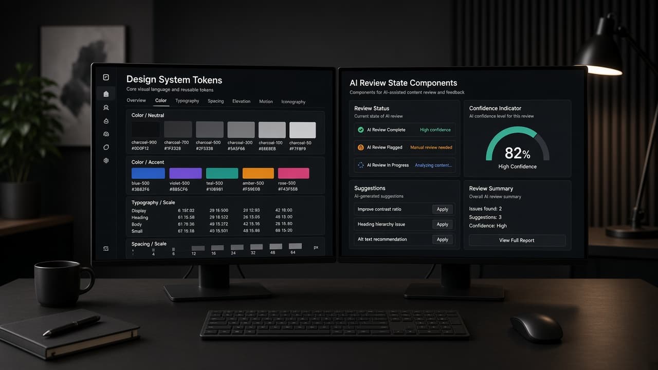
11 min read
Design Systems for AI Features: Primitives, Review States, and Shipping Velocity
A practical guide to building a design system for AI features in SaaS: plan preview, approval, receipt, loading, and error primitives; generative UI tokens; review states; and how systems accelerate engineering.
Why a design system for AI features is a velocity bet
Every SaaS team added AI in 2025–2026. Most teams added it the same way: a new floating button, a one-off modal, a bespoke loading shimmer, and a different shade of purple for every squad. By sprint six, the product looked like five vendors stitched together. Engineering spent more time debating spacing in pull requests than improving model quality.
A design system for AI features is not a Figma vanity project. It is the shared contract that lets product, design, and engineering ship reviewable AI without reinventing trust UI every sprint. When plan preview, approval, receipt, loading, and error states exist as documented primitives, squads compose features instead of painting them from scratch.
The business case is straightforward. AI surfaces fail when users cannot tell what the system did, what it guessed, and what requires their judgment. Inconsistent review UI trains people to click through blindly—or disable AI entirely. A system reduces that tax by making the review path predictable across workflows.
This guide is for founders and design leads who already ship features but feel AI UI drifting. We cover an AI component library SaaS teams can adopt incrementally, generative UI design tokens that constrain layout without killing speed, AI feature review states UX as first-class patterns, and design system velocity engineering—the measurable ways systems shorten sprints.
If you only read one section, read the primitive list. Models change monthly. The review contract is what customers remember. Founders shipping B2B SaaS in 2026 should treat this as a product decision with measurable outcomes, not a branding exercise. Prototype the smallest slice that proves the pattern, instrument hesitation and completion, and iterate on copy and placement before expanding scope. Teams that skip this discipline often ship polished demos that fail in week-two retention because the interaction model never matched the job.
Primitive-first: the five AI surfaces every SaaS needs
Start with five primitives before you debate illustration style.
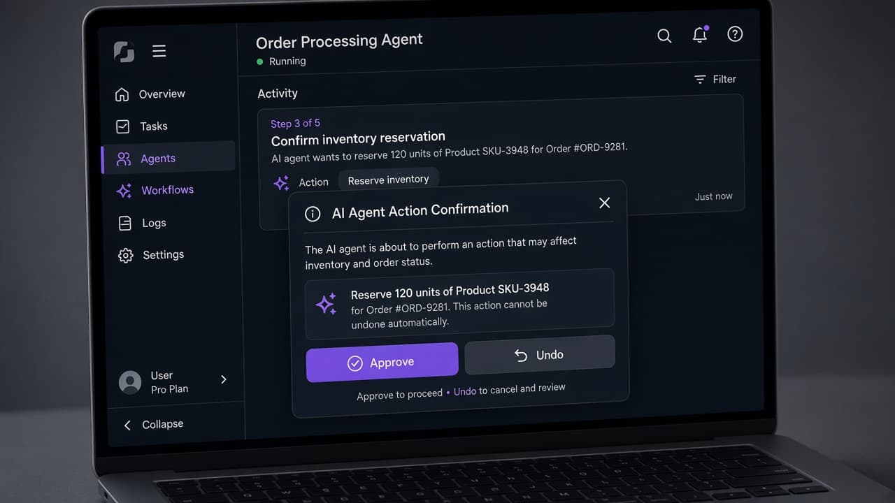
Plan preview shows what the system intends to do before it acts. It is ordered steps in plain language, editable, with evidence links—not a chat transcript. Approval captures human judgment on consequential steps. It names blast radius, required role, and primary Approve with secondary Edit and Cancel. Receipt summarizes what ran after the fact: actor, time, tools, objects changed, failures. Loading communicates partial progress without hijacking the canvas—side panel timeline beats modal spinner. Error explains what failed, what is safe to retry, and what needs human input without blaming the user.
These five map to user mental models across domains. A CRM copilot, an analytics explainer, and a billing assistant differ in content but not in structure. Users ask: what will happen, can I stop it, what happened, is it still working, what broke?
Document each primitive with anatomy, states, and forbidden variants. For example, approval must never auto-dismiss into execution. Receipt must never be only a toast that disappears. Loading must never block the entire app for read-only summarization.
Engineering wins when primitives have stable prop names: intentSummary, steps, evidence, riskLevel, onApprove, onEdit, onCancel. Design wins when squads stop arguing about button order in every feature review.
Ship one vertical slice using all five primitives on a low-risk workflow before expanding to agents. Breadth without primitives produces demos, not products. Founders shipping B2B SaaS in 2026 should treat this as a product decision with measurable outcomes, not a branding exercise. Prototype the smallest slice that proves the pattern, instrument hesitation and completion, and iterate on copy and placement before expanding scope. Teams that skip this discipline often ship polished demos that fail in week-two retention because the interaction model never matched the job.
AI component library SaaS teams actually maintain
Libraries fail when they catalog screenshots instead of behaviors. An AI component library SaaS engineers adopt includes variants for risk level, density, and role visibility—not only light and dark themes.
Core components to spec in v1: AiPlanCard, AiApprovalDialog, AiReceiptPanel, AiRunTimeline, AiEvidenceList, AiConfidenceBadge, AiAutonomyDial, AiUndoBanner. Each needs empty, loading, success, partial failure, and denied states. Storybook stories should show realistic copy, not lorem ipsum.
Name components for jobs, not models. AiGptPanel ages poorly. AiPlanCard survives vendor changes. Keep chat-specific pieces optional. Many B2B flows never need a message bubble—they need structured output.
Pair each component with acceptance criteria engineering can test: keyboard focus trap on approval, aria-live region for run completion, minimum touch targets on mobile admin views. Accessibility is not a polish pass; it is part of the trust model.
Governance stays light. A rotating steward approves new variants weekly. Deprecations get a changelog entry. Feature teams may propose one new variant per sprint if it includes migration notes. Heavy design ops kills adoption in startups; zero governance kills consistency.
Measure library usage like product analytics: percent of new AI UI built from library components, time to implement a standard approval flow, QA bugs tagged design-system on AI surfaces. If numbers stay flat, the library does not fit real workflows—fix the primitives before adding icons. Founders shipping B2B SaaS in 2026 should treat this as a product decision with measurable outcomes, not a branding exercise. Prototype the smallest slice that proves the pattern, instrument hesitation and completion, and iterate on copy and placement before expanding scope. Teams that skip this discipline often ship polished demos that fail in week-two retention because the interaction model never matched the job.
Generative UI design tokens that constrain hallucinated layout
Generative UI tempts teams to let models invent screens on the fly. Without constraints, every session looks like a different product. Generative UI design tokens solve that by giving models a kit, not a blank canvas.
Define tokens for AI-specific semantics: surface-ai-panel, border-ai-active, text-ai-inference, text-ai-fact, spacing-ai-step, radius-ai-card. Map them to your core theme so AI features feel native, not bolted on.
Layout tokens matter as much as color. Specify max line length for plan steps, grid for evidence columns, and elevation for approval overlays. Document which containers AI may populate: side panel, inline card, modal—forbidden full-page takeovers except high-risk batches.
Prompt templates for internal tools should reference token names, not hex values. When design updates a token, generated UI updates everywhere. That is how you get design system velocity engineering instead of whack-a-mole CSS.
Anti-pattern: letting the model output arbitrary HTML classes. Pattern: model outputs JSON schema your renderer maps to components. The renderer enforces tokens and component boundaries. Design controls composition; the model fills content.
For MVPs, a dozen AI tokens and five layout recipes cover most copilots. Expand when you have two squads shipping conflicting patterns—not before. Founders shipping B2B SaaS in 2026 should treat this as a product decision with measurable outcomes, not a branding exercise. Prototype the smallest slice that proves the pattern, instrument hesitation and completion, and iterate on copy and placement before expanding scope. Teams that skip this discipline often ship polished demos that fail in week-two retention because the interaction model never matched the job.
AI feature review states UX as a first-class pattern
Review states are where trust is won or lost. AI feature review states UX should be as documented as button hover—not an engineer's improvisation per feature.
Standard states: Suggested (read-only, no side effects), Draft (editable, not committed), Pending approval (blocked on human), Running (visible progress), Completed (receipt available), Failed (retry path), Undone (compensating action shown). Each state gets iconography, copy tone, and allowed actions.
Transitions must be explicit. Draft to Pending approval happens when user clicks Queue or Send for review—not silently on timer. Running to Completed must surface a receipt anchor users can find later. Failed must preserve Draft so users do not lose work.
Role-based visibility belongs in the state machine. Viewers see Suggested. Editors see Draft. Approvers see Pending. Admins see audit linkage. Document these rules in the system so PMs do not re-specify per feature.
Visual consistency beats novelty. If every squad invents a new progress animation, users cannot parse urgency. One timeline component, three density modes, done.
Test review states with five users on one real workflow before shipping a second AI feature. Watch where they think an action already happened when it has not. Fix state copy before adding tools. Founders shipping B2B SaaS in 2026 should treat this as a product decision with measurable outcomes, not a branding exercise. Prototype the smallest slice that proves the pattern, instrument hesitation and completion, and iterate on copy and placement before expanding scope. Teams that skip this discipline often ship polished demos that fail in week-two retention because the interaction model never matched the job.
Design system velocity engineering: how systems speed shipping
Design system velocity engineering is the practice of tying system investment to sprint metrics—not slide decks about consistency.
Before the system: baseline hours to ship an approval modal, number of one-off AI CSS files, design review rounds on trust UI, production bugs on focus and mobile. After adoption: same metrics at six weeks. Healthy teams cut implementation time on standard AI flows by thirty to fifty percent because engineers clone stories instead of guessing.
Velocity comes from decision removal. When plan step spacing, evidence link style, and Approve button hierarchy are decided, squads argue about workflow policy—not pixels. That shift moves debates upstream where they belong.
Systems also speed experimentation. Feature flags plus stable primitives let you A/B copy on approval cards without forking layout. Analytics on Approve, Edit, and Reject rates become comparable across features because the UI shape is constant.
Do not confuse velocity with freezing creativity. Innovation belongs in workflow design and evaluator quality—not in reinventing a receipt panel every sprint. The system should expose extension slots: custom evidence renderers, domain-specific risk badges—without breaking anatomy.
Founders should ask design partners for a velocity plan, not only a component gallery. At Mool Studio we ship a starter kit and a migration map for the first two AI features, then measure adoption before expanding tokens.
Governance without killing experimentation
The failure mode of design systems is bureaucracy. The failure mode of no system is chaos. Governance for AI features needs a narrow lane.
Weekly office hours: squads demo new AI UI, steward decides adopt, extend, or fork temporarily. Temporary forks expire in one sprint unless promoted. Promoted patterns require Storybook, props table, and accessibility checklist.
Version the AI kit separately from marketing components. AI patterns evolve faster. Semantic versioning on AiApprovalDialog lets engineering pin while design iterates copy defaults.
Document anti-patterns beside patterns: no auto-send toggles hidden in settings, no irreversible actions from chat alone, no receipts as ephemeral toasts. Anti-patterns prevent regressions when new hires ship fast.
Security and legal review hooks belong in the system docs. When AI touches PII or exports, approval must show data classification. When outputs are advice not fact, inference styling is mandatory. Product counsel should sign the pattern doc once, not every feature ticket.
Experimentation thrives when primitives are stable and content is flexible. Let squads change step copy, evidence fields, and evaluator rules. Do not let them move Approve below the fold without explicit risk acceptance.
Starter checklist for your next sprint
Use this checklist to launch a design system for AI features without a quarter-long initiative.
Day 1: Inventory existing AI UI in product screenshots. Tag which screens use plan, approval, receipt, loading, error—or ad hoc substitutes.
Day 2: Draft primitive anatomy in Figma with one real workflow. Pick low-risk draft-and-review, not autonomous send.
Day 3: Define ten AI semantic tokens mapped to code variables. Pair with engineering on prop names for AiPlanCard and AiApprovalDialog.
Day 4: Build Storybook stories for five states on each primitive. Include mobile and keyboard paths.
Day 5: Migrate one shipped feature to the library. Measure diff size and QA time saved.
Day 6–7: Usability test review states with five users. Fix copy and transitions before second migration.
Success looks boring: new AI features snap into place, receipts look familiar, approvers know where to click. That boredom is design system velocity engineering paying off.
If you are choosing a design partner for AI-heavy SaaS, bring this checklist to kickoff. Systems beat mockups when you need to ship trust UI every sprint—not once for a demo.
Related articles
11 min read
Answer Engine Optimization for SaaS: Get Your Product Cited in AI Answers
SEO still matters—but buyers now ask AI assistants first. AEO is how you get your SaaS cited in those answers with pages models can quote accurately.
11 min read
Progressive Disclosure in SaaS UX: How to Hide Complexity Without Hiding Value
Complex SaaS does not need a simpler product—it needs a smarter sequence. Progressive disclosure shows power without dumping every toggle on day one.