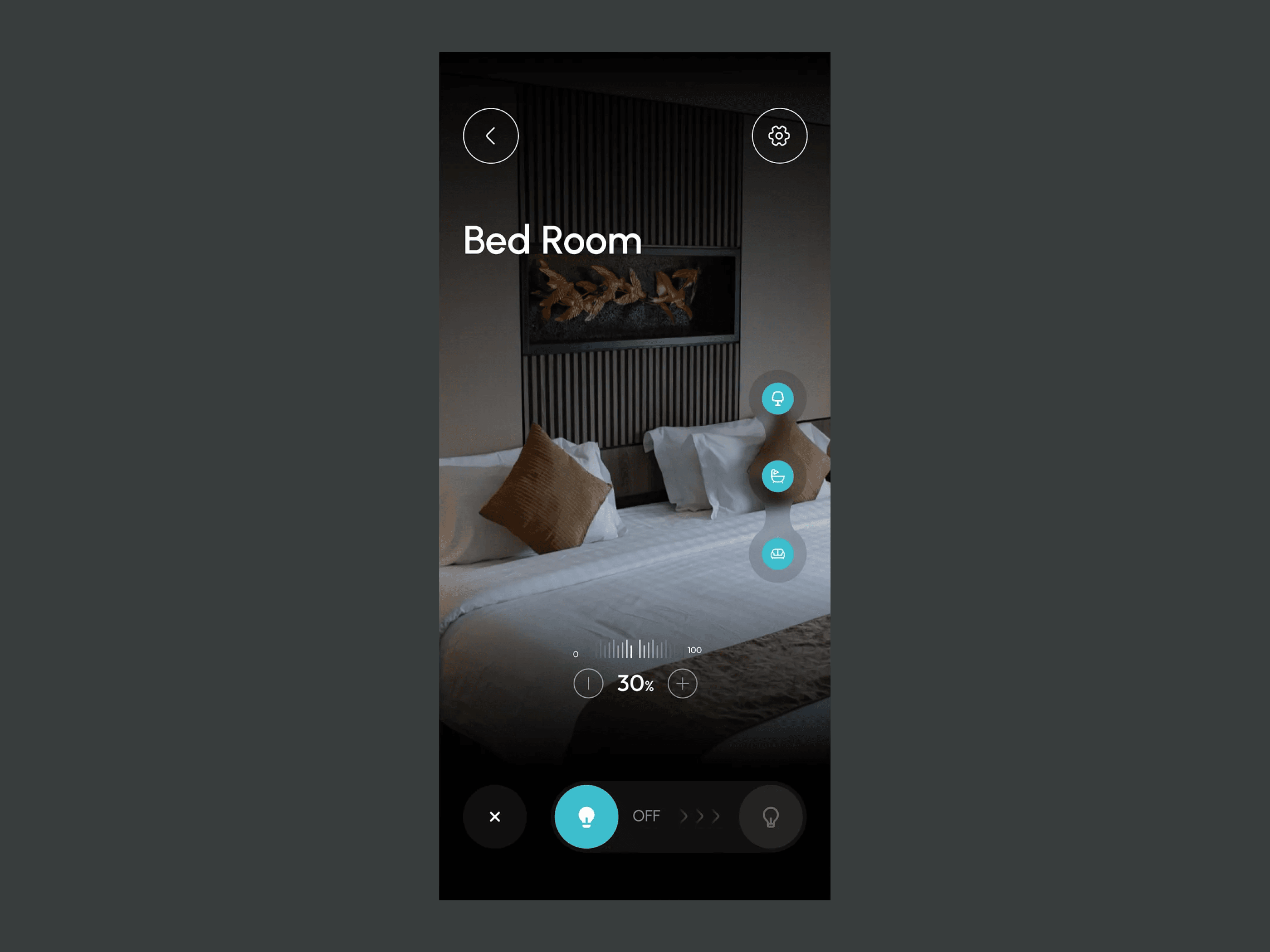
A calmer control center for the connected home
Designed a unified smart home app that reduced daily interactions by 40% while giving users confident control over every room, routine, and device.

The existing app forced users to hop between tabs for lights, climate, security, and routines. We rebuilt the experience around rooms and intent — one screen, a calm palette, and clear glanceable state for every device in the home.
The challenge
The product shipped with a feature-first IA that made sense to engineers but confused customers. People couldn't find the lights they wanted to dim, routines were buried three levels deep, and the home screen showed 20 widgets without hierarchy.
Our approach
We ran diary studies with 18 households to map real daily behaviors, restructured the app around rooms and moments, and introduced a 'scene' model so morning, focus, and movie modes become one-tap experiences. A quiet monochrome system keeps the interface calm even with dozens of devices connected.
The outcome
Daily interactions dropped 40% because the right action is now one tap away. Automation usage more than tripled, and the rating jumped from 3.9 to 4.8 within two release cycles.

It finally feels like the home is running us, not the other way around. One tap for morning, one tap for movie night — that's the whole product.
More work
Some other app designs

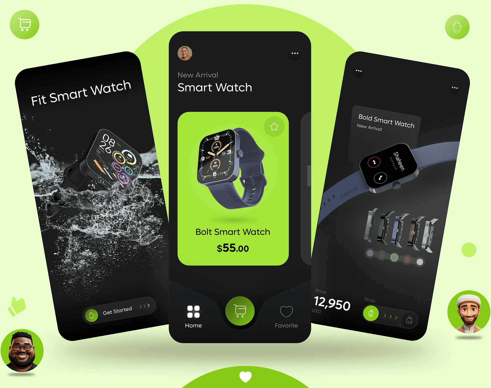
Smart Watch App

Chat App
AI Powered Garden Scanner

Have a project like this?
We'd love to hear what you're working on. Share the details and we'll get back within 24 hours.