Back to blog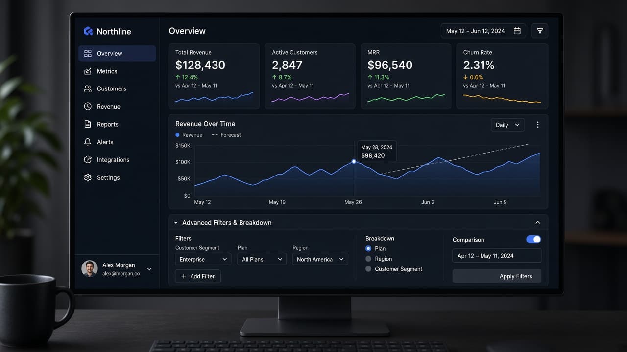
Disclosure levels for B2B SaaS dashboards

11 min read
Progressive Disclosure in SaaS UX: How to Hide Complexity Without Hiding Value
Practical progressive disclosure SaaS UX for complex B2B dashboards: levels of reveal, role-based disclosure, advanced settings patterns, and mistakes that bury core value.
Progressive disclosure SaaS UX is how complex products stay usable
Enterprise-grade capability and beginner-friendly first sessions rarely coexist by accident. They coexist when teams design progressive disclosure SaaS UX deliberately—sequencing what appears when, for whom, and after which success signals.
Progressive disclosure is not hiding features to trick users into upgrades. It is matching cognitive load to the user's current job. A finance admin needs tax codes on day one; a team member inviting colleagues does not. Showing everything to everyone produces clutter, support tickets, and the false conclusion that your product is "too complex" when the real failure is presentation order.
B2B dashboards accumulate modules over years: reporting, automation, permissions, integrations, audit logs. The information architecture complexity is real. Disclosure is how you honor that complexity without making new users feel they landed in an airplane cockpit.
This article covers levels of reveal, SaaS information architecture complexity without maze navigation, tactics to reduce SaaS UI clutter while keeping value visible, role based progressive disclosure, SaaS advanced settings UX patterns power users respect, and anti-patterns that bury value instead of sequencing it.
Founders often ask whether to simplify the product. Sometimes yes—but often the fix is disclosure, defaults, and role-aware surfaces before cutting capability paying customers rely on. Founders shipping B2B SaaS in 2026 should treat this as a product decision with measurable outcomes, not a branding exercise. Prototype the smallest slice that proves the pattern, instrument hesitation and completion, and iterate on copy and placement before expanding scope. Teams that skip this discipline often ship polished demos that fail in week-two retention because the interaction model never matched the job.
Four disclosure levels every complex dashboard should name
Teams ship faster when they share vocabulary. Name four disclosure levels in your design spec and engineering tickets.
Level 0 — Always visible: the one job the persona hired the product to do today, plus navigation to complete it. For a support tool, queue + reply. For analytics, the primary metric and date range.
Level 1 — One click away: filters, sort, export, column pickers—frequent power actions that should not crowd Level 0. Use explicit "Filter" and "Columns" controls, not mystery icons.
Level 2 — Contextual advanced: settings that apply to the current object—SLA rules on a inbox, chart type on a report—not global admin. Reveal when user selects an object or clicks "Advanced" inline.
Level 3 — Admin and policy: roles, billing, SSO, webhooks, audit retention—infrequent, high-risk. Lives in admin areas with guardrails, not on the home screen.
Document which level each new feature belongs to before Figma work. PMs default to Level 0 because visible features feel shipped. Designers push back with the persona's first-week job story.
Disclosure levels are not permission levels—they intersect but differ. A viewer may see Level 0 only; an admin may still hide Level 3 behind admin nav even if they have access. Founders shipping B2B SaaS in 2026 should treat this as a product decision with measurable outcomes, not a branding exercise. Prototype the smallest slice that proves the pattern, instrument hesitation and completion, and iterate on copy and placement before expanding scope. Teams that skip this discipline often ship polished demos that fail in week-two retention because the interaction model never matched the job.
| Level | User expectation | Examples | Reveal trigger |
|---|---|---|---|
| 0 — Core | I can finish today's job | Primary table, create action | Always |
| 1 — Frequent power | I can adjust how I work | Filters, sort, saved views | Explicit control |
| 2 — Contextual advanced | I can tune this object | Field rules, chart config | Selection or Advanced |
| 3 — Admin / policy | I configure the system | Roles, SSO, billing | Admin navigation |
SaaS information architecture complexity without maze navigation
Information architecture complexity grows with modules. Progressive disclosure fails if navigation itself is a puzzle. Users should always know where they are, how to return to home, and which area owns admin tasks.
Use stable top-level zones: Work, Records, Reports, Automations, Admin—names matched to buyer language, not internal squad names. Limit top nav to five to seven items; defer rare areas to search and command palette.
Prefer object-centric IA for operational tools. Users think in tickets, deals, projects—not in your microservice boundaries. Attach Level 2 advanced to object pages instead of scattering related controls across three settings areas.
Search and command palette are disclosure allies. Obscure Level 3 features remain discoverable without occupying permanent chrome. Instrument search queries to find missing synonyms—if users search "webhook" and land nowhere, fix IA labels.
Breadcrumbs and page titles must reflect mental models. "Workspace > Billing > Tax settings" beats "Account > Module 4." Renaming is cheaper than retraining every user session.
When adding a module, decide its home before launch. Orphan features land on Level 0 by default and clutter follows. A deliberate home—even a nested one—preserves clarity.
Review IA when activation metrics stall. If new users never reach Level 1 features that drive retention, the issue may be sequencing—not discoverability alone. Founders shipping B2B SaaS in 2026 should treat this as a product decision with measurable outcomes, not a branding exercise. Prototype the smallest slice that proves the pattern, instrument hesitation and completion, and iterate on copy and placement before expanding scope. Teams that skip this discipline often ship polished demos that fail in week-two retention because the interaction model never matched the job.
How to reduce SaaS UI clutter without hiding core value
Reduce SaaS UI clutter by removing simultaneous demands, not by removing capability. Clutter is often duplicate entry points: three buttons that create a record, two menus for export, four notification bells.
Audit chrome quarterly. For each control ask: does this persona need it visible this week? If not, demote one level or move to overflow with a labeled menu—not nameless kebab icons alone.
Defaults carry disclosure. Pre-select the filter new users need. Hide chart types they will not understand until week three. Show sample data so Level 0 is informative, not empty paranoia.
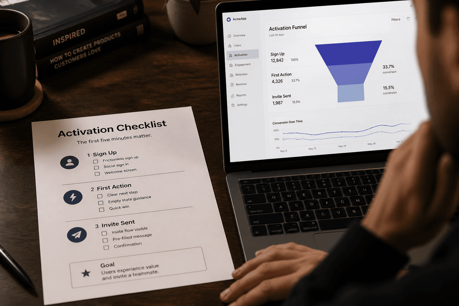
Empty states teach disclosure. Instead of blank tables, explain the one action that populates the view and tease Level 1 features with ghost rows or checklist onboarding—not a twelve-step tour.
Visual hierarchy enforces sequence. Primary button one per screen. Secondary actions grouped. Destructive actions separated and labeled. When everything is bold, nothing is progressive.
Marketing screenshots tempt teams to show every module on the hero dashboard for sales. Product UI should not copy demo mode. Sales demos can use a "full capability" workspace; production defaults stay lean.
Measure clutter with usability tasks: time to find primary action, mis-clicks on advanced controls during first session, support tickets tagged "cannot find X" where X is Level 1. Fix sequencing before adding another nav item. Founders shipping B2B SaaS in 2026 should treat this as a product decision with measurable outcomes, not a branding exercise. Prototype the smallest slice that proves the pattern, instrument hesitation and completion, and iterate on copy and placement before expanding scope. Teams that skip this discipline often ship polished demos that fail in week-two retention because the interaction model never matched the job.
Role based progressive disclosure for B2B teams
B2B products serve multiple personas with different disclosure needs. Role based progressive disclosure maps levels to roles without building entirely separate products—within reason.
Define role templates: Viewer, Contributor, Manager, Admin. Map each to maximum disclosure level on first login. Viewers see Level 0–1 on assigned objects. Admins reach Level 3 but still should not see every admin panel on the home screen.
Use capability flags, not only job titles. A contributor with "billing view" unlocks specific Level 3 read-only panels without full admin. Fine-grained flags beat coarse roles when you scale upmarket.
Onboarding should ask minimal questions to pick a template—team size, primary job, industry vertical—then apply a disclosure profile. Let users self-serve "Show advanced controls" with a persistent toggle stored per user, not only per role.
Avoid humiliating power users. If a CFO logs in and cannot find export because you hid everything, disclosure backfires. Provide escape hatches: "Switch to power layout," command palette entries, pinned shortcuts users configure once.
Audit logs and compliance screens often belong to Admin only—but surface read-only summaries to managers when regulations require visibility without edit rights.
When design partners prototype dashboards, bring role matrix to kickoff. Figma variants per role prevent the fantasy single UI that pleases nobody in production. Founders shipping B2B SaaS in 2026 should treat this as a product decision with measurable outcomes, not a branding exercise. Prototype the smallest slice that proves the pattern, instrument hesitation and completion, and iterate on copy and placement before expanding scope. Teams that skip this discipline often ship polished demos that fail in week-two retention because the interaction model never matched the job.
SaaS advanced settings UX that power users respect
Advanced settings earn trust when they behave predictably—not when they feel like a junk drawer.
Group settings by outcome: Notifications, Data retention, Integrations, Security—not by engineering squad. Each group opens to a focused page with save boundaries scoped to that group.
Use explicit save bars for Level 3 changes. Auto-save is fine for Level 1 filters; role changes and webhooks need review. Show diff summaries: "You are about to disable SSO for 120 users."
Danger zones get friction: type-to-confirm, dual approval for production workspaces, links to rollback docs. Friction is respect for blast radius.
Inline help beats tooltip spam. Short paragraphs explain who should change a setting and what breaks if wrong. Link to deeper docs; do not embed novels.
Power users want bulk and API paths. When UI disclosure hides complexity, expose equivalent API or CSV paths documented beside the UI control. Parity reduces shadow IT scripts.
Search within settings for products with hundreds of toggles. Highlight deprecated settings with migration CTAs. Nothing erodes trust like a toggle that no longer connects to code.
Test advanced settings with admin personas separately from first-week onboarding tests. Different success metrics: task completion time and error rate, not activation in five minutes. Founders shipping B2B SaaS in 2026 should treat this as a product decision with measurable outcomes, not a branding exercise. Prototype the smallest slice that proves the pattern, instrument hesitation and completion, and iterate on copy and placement before expanding scope. Teams that skip this discipline often ship polished demos that fail in week-two retention because the interaction model never matched the job.
Mistakes that bury value instead of sequencing it
Progressive disclosure fails in predictable ways. Recognize them early.
Burying the core job: hiding create actions behind menus to look minimalist. Level 0 must stay obvious.
Permanent hiding: features with no discoverability path—no search, no docs link, no upgrade hint when appropriate. Disclosure without discovery is amputation.
Inconsistent depth: one module uses Advanced tabs, another uses mystery icons, a third dumps forms. Consistency is part of disclosure grammar.
Using disclosure to mask unfinished UX: "We will put it in settings later" when settings is a swamp. Fix the workflow or cut scope.
Role mismatch: contributors blocked from actions they need daily because admins hoard levels. Revisit role maps with customer evidence.
Over-reliance on tours: modal walkthroughs that replace IA. Tours expire; structure persists.
Dark patterns: hiding cancel plan or export data to reduce churn. Disclosure is not deception. Regulators and AI summaries both punish opaque products.
When retention drops after a "simplification" release, check whether you hid value users paid for. Restore visibility at Level 1 with better labeling before rolling back capability.
Run a one-sprint disclosure audit
Block two hours with product, design, and engineering. Open the default new-user workspace—not the sales demo.
List Level 0 controls. Ask: can a motivated new user complete the core job in one session? If not, promote controls before demoting others.
Tag every nav item with disclosure level and primary persona. Kill duplicate paths. Merge settings groups that confuse admins.
Add or fix Advanced entry points on object pages missing Level 2 homes. Ensure command palette indexes renamed features.
Ship one role template change based on support tickets. Measure ticket volume for two weeks.
Document disclosure rules in your design system: when to use tabs, accordions, modals, separate pages. Engineers should not invent a fifth pattern per sprint.
Progressive disclosure SaaS UX is never finished. Products gain modules; roles multiply. Revisit levels each quarter the way you revisit pricing—on purpose, with evidence.
Founders working with Mool Studio on dashboard redesigns should bring support transcripts and activation funnels to scope. Disclosure decisions are product strategy, not last-minute Figma cleanup.
Related articles
11 min read
Design Systems for AI Features: Primitives, Review States, and Shipping Velocity
AI features ship faster when design systems define the review contract first—primitives, tokens, and states—not when every squad invents its own sparkle button.
11 min read
Answer Engine Optimization for SaaS: Get Your Product Cited in AI Answers
SEO still matters—but buyers now ask AI assistants first. AEO is how you get your SaaS cited in those answers with pages models can quote accurately.