Back to blog

Pick one AI surface for an MVP
11 min read
Stop adding an AI chat: design intent-based UX for SaaS MVPs
Why a floating AI chatbot is not a product strategy, and how to design intent-based UX—command palettes, side panels, and reviewable results—for an early SaaS MVP.
The chat widget is not a product strategy
Most early SaaS teams added AI the same way they once added a chatbot to a marketing site: a floating button, a blank text field, and a promise that customers can “just ask.” It ships fast. It demos well. It rarely becomes the way people actually finish work.
In 2026, the products that retain users treat AI as infrastructure inside a job, not as a destination. Users describe an outcome. The product executes steps, then shows a reviewable result. The dashboard does not disappear, but it stops being the only front door. That shift is what people mean by intent-based UX.
This is not a call to delete every screen. Chat is a poor interface for comparing numbers, confirming an irreversible action, or editing something exactly. Visual UI still wins for precision. Language wins when the outcome is clear and the shortest path is not. The design job is to split that labor on purpose.
For an MVP, the cost of getting this wrong is high. A generic assistant trained on your help center looks like innovation in a pitch deck and like a support ticket in week two. Founders then conclude “AI didn’t work,” when the real failure was scoping: you shipped a conversation instead of a completed job.
Mool Studio’s advice is the same discipline we use for any first release. Name the job. Name the user. Name the moment of value. Then decide whether language, a command palette, a side panel, or a normal form is the fastest path to that moment. If you cannot say which job the model is hired to do, you are not ready to put a text box in the product.
Intent-based UX: users state a job, the product executes
Intent-based interfaces invert the old SaaS pattern. Dashboard-first products ask users to learn your information architecture, find the right report, configure filters, and interpret the chart. Intent-first products ask users to state the outcome: create last month’s campaign report, invite three teammates and assign one task, reconcile this week’s expenses against policy.
The product then does the navigation. It may still render a dashboard as the artifact. The difference is who holds the map. When users have to hunt, first-week retention suffers. When they can name the job and land on a result, time-to-value compresses.
That does not mean every surface becomes a prompt. A good intent layer is narrow. It knows the verbs your product actually supports. It refuses work it cannot verify. It returns structured output you can inspect: a table, a draft, a diff, a checklist of what it changed and what it did not.
The anti-pattern is an unbounded chat that can “help with anything.” Unbounded chats hallucinate navigation, invent features, and train users to argue with the product instead of completing a workflow. Bounded intent is closer to a command palette with a brain: a small set of jobs, explicit inputs, and a review step.
If you are scoping an MVP, pick one intent that maps to your core loop. For a project tool, that might be “create a project, add three tasks, invite one teammate.” For analytics, “explain the largest drop in activation this week with linked charts.” For billing, “draft a dunning email for invoices seven days overdue; do not send.” One complete job beats a general assistant every time.
Three patterns that actually ship
The industry has settled on a small set of patterns. You do not need to invent a new interaction model. You need to pick the one that matches frequency and risk.
Command palettes are now baseline in serious B2B products. Cmd+K (or Ctrl+K) lets power users jump to any action by name. When you add AI, the palette can accept a goal instead of an exact command: “show overdue invoices for enterprise accounts” rather than remembering the filter recipe. Keep the palette for navigation and well-named actions. Do not hide destructive operations only inside a free-text box.
Side-panel assistants work when the user is already in a record. The main canvas stays visible. The assistant proposes the next step, a summary, or a draft without taking over the screen. This is the right default for CRM, support, and admin tools. Ambient beats chat-first when people need to see the object they are changing.
Generative defaults on forms are underrated. Prefill a project name, a first milestone, or a reasonable date range from context. Let the user edit. This is often more valuable than a conversation, because it respects the form as the source of truth and uses the model only to remove blank-page friction.
Chat-as-editor belongs in products where the artifact is language or code. It is the wrong primary UI for an operations dashboard. If your MVP is not Cursor, do not copy Cursor’s layout because it looks modern.
Pick one pattern for v1. Supporting three AI surfaces in an MVP is the same mistake as shipping three navigation models. One intent entry, one review surface, one way to undo.
| Pattern | Best for | Avoid when |
|---|---|---|
| Command palette | Named actions and bounded intents | Destructive actions with no review |
| Side-panel assistant | Work already on a record | The user has no object in context |
| Generative form defaults | Blank-page friction on known fields | Unverified data written as fact |
| Chat-as-editor | Language or code artifacts | Operations dashboards and confirmations |
When screens still win
Intent should not replace confirmation, comparison, or fine editing. Those jobs need visual structure.
Confirmation is a screen because consequences need to be seen. If the product is about to send fifty emails, change a production flag, or delete a workspace, a sentence in a transcript is not enough. Show the target, the count, the sample, and a primary action that is easy to refuse.
Comparison is a screen because tables beat paragraphs. Users comparing plans, cohorts, or campaign variants need to scan. An assistant can assemble the table. It should not narrate the table as a wall of text and call that a result.
Fine editing is a screen because people correct details in place. A generated onboarding flow still needs a designer or founder to change a label, reorder a step, or fix an empty state. Generate the first pass. Edit on a canvas.
A practical split looks like this. Language for open-ended requests where the path is unclear. Palette for named actions the user already understands. Canvas for the artifact. Modal or review card for anything irreversible. If your AI feature cannot point to which of those four it is, it is not designed yet. It is a demo.
This is also why “replace the dashboard” is a bad MVP slogan. Dashboards remain the place you audit what happened. Intent is the place you start. Teams that delete the dashboard before they have a trustworthy intent layer leave users with a magic box and no map.
Design the job before you design the model
Founders often start with a model picker. The better start is a job story. When a new team lead is in their first session, they want to invite colleagues and assign one shared task so they can see whether anyone will use this product tomorrow. That sentence tells you the intent, the success state, and the non-goals.
Write three artifacts before anyone prompts a model. First, the job and the metric: activation in session one, not “users love AI.” Second, the allowed verbs: create, draft, summarize, recommend. Explicitly exclude send, delete, publish, and production changes unless a human confirms. Third, the evidence the result must include: source records, timestamps, and a short action log.
Then map the interface. Where does the user type or speak the intent? What do they see while work runs? What artifact do they get? How do they correct it? How do they undo? Those five questions are the UX spec. The model is an implementation detail inside that spec.
If you work with a design partner, bring the job story to the kickoff, not a mood board of chat bubbles. We can prototype the intent entry, the review card, and the empty state faster than we can debate which foundation model is “best.” Model quality changes monthly. A clear job does not.
Scope still matters. An intent layer that can do twenty jobs poorly will feel dumber than one job done completely. Ship the complete path: intent, execution, review, save. Instrument it. If users never invoke it, you learned something about demand. If they invoke it and abandon the review, you learned something about trust. Both are more useful than a vanity “AI” badge on the landing page.
Trust affordances: undo, evidence, and approval
Users have never been more exposed to AI, or more suspicious of it. Trust is now a UX requirement, not a legal footnote.
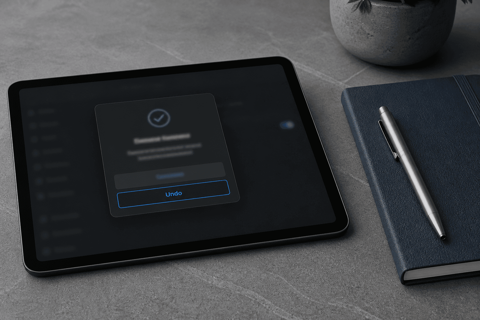
Every autonomous or semi-autonomous action needs a visible way to correct it. Undo is the minimum. For sends and publishes, the minimum is a draft that does not go out until someone clicks. For recommendations, show why: the source record, the rule, the date. For generated UI or copy, show that it is a suggestion and make editing the default, not a hidden overflow menu.
Confidence should be honest. If the product is guessing, say so. Fake certainty is how you get silent data corruption. A useful pattern is to separate facts found in the system, inferences, actions already taken, and actions waiting for approval. That structure is as relevant in a SaaS copilot as it is in an agent product.
Do not bury the exit. If personalization or an agent is acting on the user’s behalf, say so, and give a one-click way to reset or take back control. Trust erodes the moment a “smart” feature feels like a trap.
For MVPs, this is good news. Trust UI is cheaper than a bigger model. A review card with three bullets and an Approve button will outperform an unbounded agent that emails customers while you sleep. Start read-only. Graduate to drafts. Only then consider actions that leave the building.
If you are building for teams, remember that the person who types the intent may not be the person who should approve the send. Role-based review is part of intent design. A marketer can draft. A lead can approve. The product should not collapse those roles because the model is capable of both.
What this means for MVP scope
An AI-flavored MVP is still an MVP. The core loop must work without the assistant. If the only way to create a project is to prompt a model, you have built a fragile demo. The intent layer should accelerate a loop that already exists in buttons and forms.
A well-scoped first release might include one primary workflow, a command palette for named actions, one intent that drafts or explains, and a review state. It should exclude a general chatbot, custom agents for every persona, and unsupervised outbound. Those are version-two ideas that depend on the first job proving value.
Design systems still matter. Tokens, eight to twelve components, and empty states are what keep generated UI from looking like a different product in every session. If you let the model invent layout from scratch, you will spend the next quarter cleaning inconsistency. Give the model a kit. Let it compose, not decorate.
Engineering capacity is part of the design. Intent UX needs structured data, event logging, and an evaluator—something that checks the output before the user sees it or before an action runs. That is product architecture, not a Figma flourish. Align the design slice with what you can instrument. An unmeasured assistant cannot be improved.
When we run scope workshops, we now add a fifth column next to launch-critical, fast-follow, and later: “AI-assisted” versus “AI-required.” Almost nothing in an early SaaS MVP should be AI-required. Plenty can be AI-assisted if the job is clear and the review is real.
How to try this in your next sprint
Do not start with a model bake-off. Start with one workflow you already know is painful. Write the job story. Prototype two versions: the current click path, and an intent path that produces the same artifact. Put both in front of five target users. Measure time to the value moment, corrections needed, and whether they trust the result enough to continue without you in the room.
If the intent path wins, implement it as a bounded command or side panel, not as a site-wide chat. Log the intent text, the tool calls, the artifact, and the accept/reject. That dataset is how you improve the feature. Without it you are decorating.
Keep a human in the loop for anything external. Draft the email. Do not send it. Recommend the budget change. Do not apply it. Summarize the incident. Do not mute the alert. Those boundaries are how you learn without lighting a customer relationship on fire.
Finally, resist the urge to announce “AI-native” on the homepage until the job is complete in the product. Users can smell a widget. They stay for a finished outcome. Intent-based UX is just product design with a more honest entry point: tell us the job, show us the work, let us approve the ending.
That is the standard we use when we design SaaS MVPs in 2026. Fewer surfaces. Clearer jobs. AI where it removes steps. Screens where judgment still lives. If you want a partner to scope that first intent and turn it into a shippable slice, bring the job story, not the chatbot mockup.
Related articles
11 min read
Design Systems for AI Features: Primitives, Review States, and Shipping Velocity
AI features ship faster when design systems define the review contract first—primitives, tokens, and states—not when every squad invents its own sparkle button.
11 min read
Answer Engine Optimization for SaaS: Get Your Product Cited in AI Answers
SEO still matters—but buyers now ask AI assistants first. AEO is how you get your SaaS cited in those answers with pages models can quote accurately.