Back to blog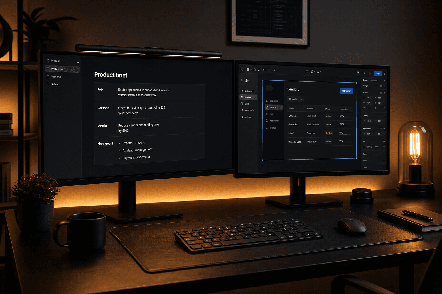

One-page product brief: six fields designers can work from

Launch-critical screens for a typical B2B SaaS MVP
11 min read
How to write a product brief designers can actually use
A one-page product brief template for SaaS founders: job-to-be-done, primary persona, success metric, non-goals, constraints, and the screens that must ship.
A feature list is not a brief
Most founders arrive at a design kickoff with a spreadsheet. Rows of features copied from a competitor, a few screenshots, maybe a Notion page titled v1 scope. That artifact feels like progress because it is concrete. Designers cannot use it. A feature list tells someone what to draw. A brief tells them what has to be true when a user is done.
The difference shows up in week two. Without a brief, every Slack message becomes a new requirement. The designer adds a settings page because a competitor has one. Engineering asks whether invites are in scope. Someone from sales wants a dashboard widget for the demo. You end up with twenty screens and no complete job. The MVP looks busy and still cannot prove the product works.
A usable brief is one page. Not a fifty-slide deck. Not a product requirements document that nobody rereads after kickoff. One page that a designer, an engineer, and a founder can keep open while they argue about a screen. If the argument cannot be settled by pointing at the brief, the brief is incomplete—or you are adding work that does not belong in this release.
This post is a template you can copy. It covers the six fields we ask founders to fill before high-fidelity work starts: the job to be done, the primary persona, the success metric, the non-goals, the constraints, and the screens that must ship. Feature lists still have a place. They belong in a backlog, not in the document that starts design.
When teams skip this step, design cycles stretch for a predictable reason: the group is still discovering the product while pixels are being pushed. Discovery is cheap in a brief and expensive in Figma. Write the brief first, then design only what it names.
The one-page brief designers will actually read
Fill every field in plain language. If you cannot fill a field, you are not ready to design that part of the product—you are ready to do more customer conversations or to cut scope. Keep the whole brief under 600 words. Designers will actually read 600 words. They will skim a ten-page spec and then ask you the same questions in Slack.
Write as if a contractor starts Monday without a kickoff call. If the brief only makes sense after you explain it, it is a slide, not a brief. Put the date and the owner on the page. When the brief changes, change the date. Silent edits are how teams ship two different products from the same Figma file.
We keep a copy of the brief next to the Figma file and in the engineering ticket epic. Same words in three places. When a request arrives mid-sprint, the first question is not whether it would be nice. It is whether it helps the job, the persona, and the metric on this page.
The table below is the whole template. Print it, paste it into Notion, or put it at the top of the FigJam board. Do not add a seventh field until the six below are honest.
| Field | What to write | What breaks if it is missing |
|---|---|---|
| Job to be done | The outcome one user completes in one sitting | Designers invent a platform instead of a loop |
| Primary persona | Role, weekly context, and current workaround | Screens try to serve everyone and help no one |
| Success metric | One number you can observe in week one of beta | Polish replaces learning |
| Non-goals | Tempting work you will refuse this release | Scope expands in comment threads |
| Constraints | Date, stack, team, compliance, brand you must keep | Specs that engineering cannot ship |
| Screens that must ship | Named flows and states, not a component inventory | Horizontal UI with no complete path |
Write the job, not the backlog
The job is the outcome, not the feature. A team lead can invite three colleagues, assign one shared task, and see completion without switching tools is a job. We need chat, file storage, integrations, and AI summaries is a backlog wearing a product hat.
Write the job as a sentence a user could finish in a sitting. If the job requires three roles, two weeks, and an admin, it is a roadmap. Split it until one person can complete it and know they succeeded. A done state is mandatory. If you cannot name how the user knows it worked, designers will decorate screens instead of completing a loop.
Jobs come from evidence: interviews, support tickets, sales notes, or a workaround you watched. Users currently paste status into a spreadsheet every Friday is a better input than users want a dashboard. The workaround tells you the job and the pain. The feature request usually tells you a competitor's marketing site.
Resist stacking jobs. Also the manager should see analytics is a second job. Put it in non-goals or in version two. Dual jobs are how MVPs grow a reporting suite before onboarding works. If two founders disagree on the job, stop designing. Disagreement about pixels is cheap. Disagreement about the job is a strategy problem. Settle it in the brief, not in a Figma comment thread.
Test the job with one sentence in a customer conversation: if we only helped you do this one outcome this quarter, would you still pay? If they hesitate, you have the wrong job or you have bundled too much into it. A brief that cannot survive that question will not survive a design sprint either.
Name one persona who must succeed first
Name one persona who must succeed in the first release. Not a demographic. A role with a weekly context: ops manager at a twenty-person logistics team who currently runs dispatch in WhatsApp and a spreadsheet. That is enough for a designer to choose language, density, and the first screen after login.
Secondary users exist. They wait. If your SaaS has an admin, a member, and an end customer, pick which of those three completes the core job in v1. The others get the minimum: an invite, a read-only view, or nothing. Designing three roles in an MVP is how you ship none of them well.
Personas fail when they are mood boards. Age, city, and favorite apps do not change a layout decision. Frequency, workaround, and what they are blamed for at work do. What happens if they fail this job this week? That pressure should show up in copy and in the default happy path. Write what this persona will not do. They will not complete a twelve-field profile. They will not watch a two-minute tour. They will not invite the whole company before they see value. Those constraints belong next to the persona, not in a separate UX manifesto.
If sales wants a buyer persona and product wants an end-user persona, put both on the brief and mark which one the first five screens serve. Marketing sites can speak to buyers. The app has to work for the person at the keyboard. When you cannot pick a primary persona, you do not have a product yet. You have a platform idea. Platforms are expensive first products. Pick a wedge user and let the others wait.
Pick a metric, list non-goals, and name the constraints
Pick one success metric you can observe in week one of beta. Useful activation examples: invited a teammate, created the first project, imported a CSV, completed a dispatch. Vanity metrics—page views, time in app, feature clicks—do not tell you if the job got done. The metric should match the job. If the job is assign a task and see it done, the metric is completed tasks by invited members, not accounts created. Signups measure marketing. Completion measures product.
Write non-goals as a list of tempting work you will refuse. SSO, mobile app, custom roles, public API, advanced reporting, dark theme, AI summaries—whatever your team keeps adding in meetings. Non-goals are not forever. They are not now. Designers need permission to ignore obvious screens. A brief without non-goals is a permission slip for scope creep.
Constraints are the physics of the project: launch date, engineer count, existing stack, brand colors you must keep, compliance you cannot skip, languages you will not support. A brief that ignores constraints produces beautiful specs nobody can ship. Ask engineering to edit this section. If they do not, the brief is still a founder document, not a team document.
Budget time as a constraint. Four weeks of design and six weeks of build changes what must ship means. Infinite polish is not a strategy; it is the absence of a date. When a stakeholder asks for something in the non-goals list, do not argue taste. Point at the metric. If the request does not move the metric this release, it stays out. If it does, you are rewriting the brief—and you should do that explicitly, with a new date, not in a hallway.
Name the screens that must ship
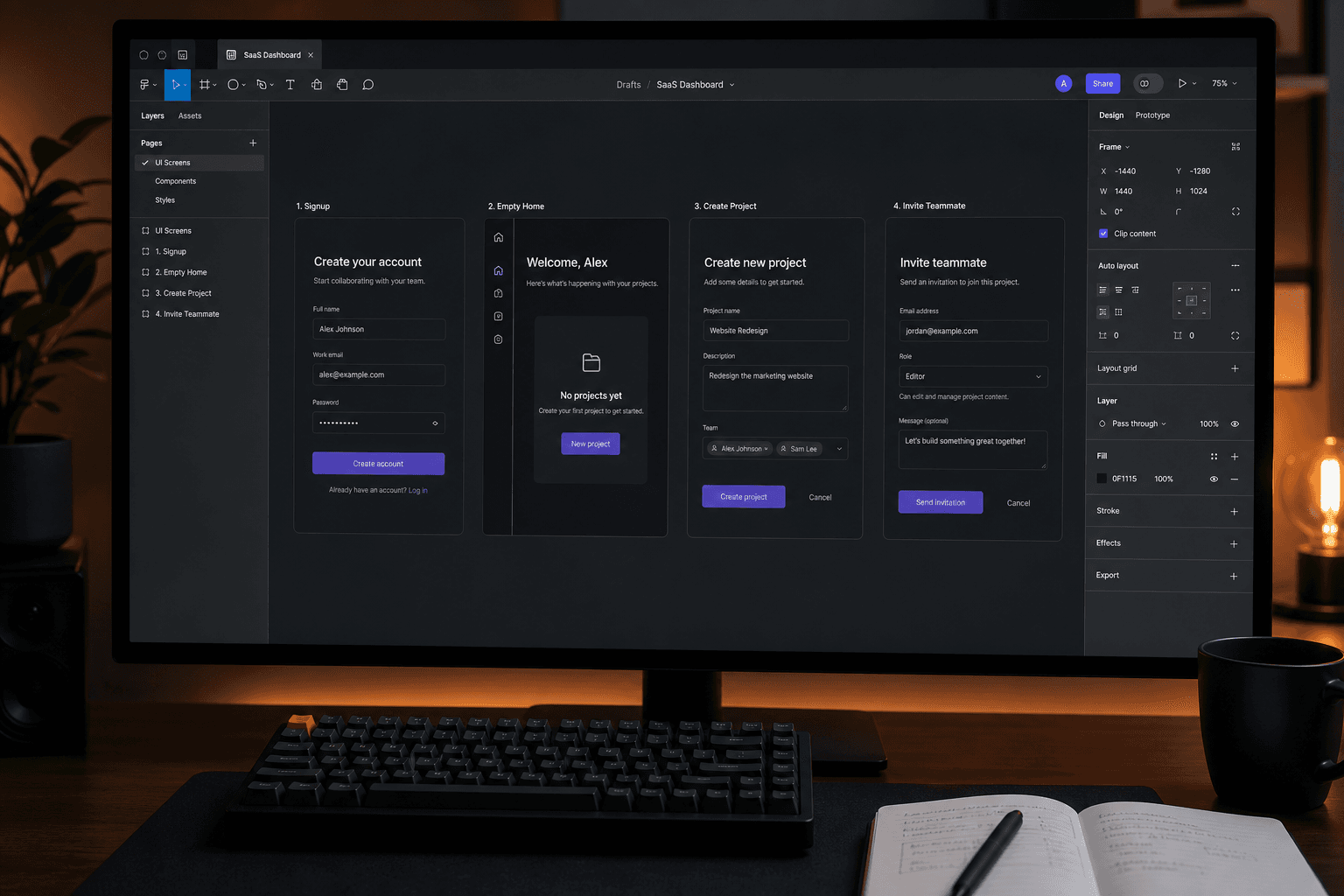
This is the part founders skip and then wonder why design feels slow. Name the screens. Not a dashboard. Name signup, create workspace, empty home, create first object, invite teammate, object detail, plus success, empty, and error for that object.
A screen list is not a sitemap of the future product. It is the minimum path that completes the job. If a screen does not sit on that path, it is not in this brief. We usually group by flow, then list states. Every launch-critical flow needs default, empty, loading, error, and success. Teams that only design the happy path discover the missing states in QA, when changing them is expensive.
Walk the list with engineering before design starts. If a screen has no API this sprint, either cut it or sequence it. Designers should not spend a week on billing if billing is month three. Keep the list short enough to screenshot in a Slack message. If you need a nested information architecture document, you have too many screens for an MVP brief.
The table below is a starting cut for a typical B2B SaaS first release. Replace the objects with yours. Do not add a column for later unless you are willing to watch it leak into the current file as hidden frames.
| Flow | Screens in v1 | Explicitly out |
|---|---|---|
| Acquire | Landing, signup, verify email | Pricing experiments beyond one clear CTA |
| Activate | Create workspace, empty home, first object | A six-step onboarding wizard |
| Share | Invite, pending invite, member home | Custom roles and SSO |
| Core job | Object list, object detail, complete action | Analytics suite and bulk export |
| Account | Basic profile, sign out | Full billing portal if you are not charging yet |
How a brief cuts design cycle time
A brief is a cycle-time tool. The waste in product design is usually not drawing. It is waiting: waiting for a decision, waiting for a founder to look at a file, waiting to find out the settings page was never in scope. A one-page brief removes a class of those waits.
Designers stop asking whether something is in for every component. They check the screen list. Engineers stop discovering surprise states in sprint planning. They see empty and error listed next to the happy path. Founders stop reviewing pixels they do not care about. They review whether the job, persona, and metric still hold.
Projects with a signed brief take fewer Figma cycles to a testable prototype. Projects that start from a feature spreadsheet take extra rounds because round one is still discovery. You pay for that either way. Paying in a document is cheaper than paying in design hours.
The brief also makes no faster. Fast-follow ideas go on a dated list under the brief, not into the current file as hidden frames that leak into build. Hidden frames become accidental scope. Use the brief in every review. Open it at the top of the call. Read the job out loud. Then look at the prototype. If a screen cannot be traced to the job or the screen list, it is exploration—and exploration should be labeled, not mixed into the production file.
When the brief is wrong, update it. Do not protect a bad brief out of process pride. The point is a shared current truth, not a sacred artifact from kickoff. Date the change. Tell engineering. Then keep designing against the new page, not against memory of the old one.
Review the prototype against the brief, not against taste
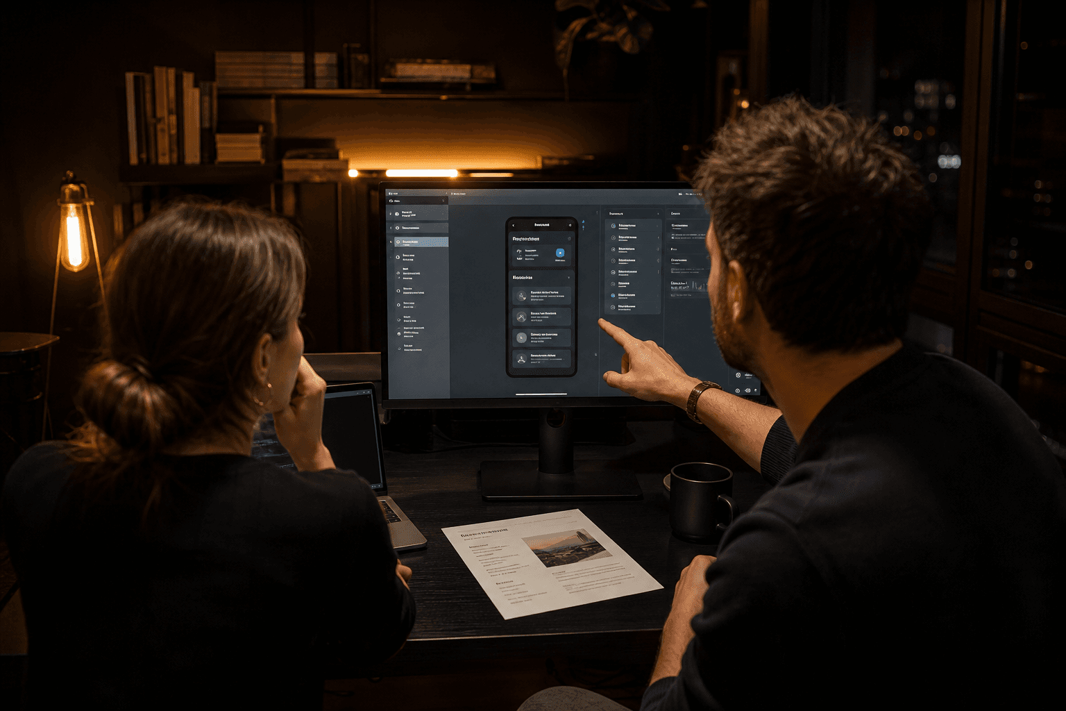
Your first design review should not start with what you think of the blue. Start with four questions. Does this complete the job? Is this the primary persona's path? Can we observe the success metric? Did we design a non-goal by accident? If the prototype fails those questions, do not polish. Change the flow. Polish on the wrong job is how teams fall in love with a demo that does not activate.
Limit the review. One owner decides. Comments from everyone, decision from one person. Cap the round: two review cycles on the prototype before you freeze the happy path and move to states. Endless taste notes are a missing brief in disguise. Bring engineering. If they cannot see how a screen will be built in this sprint, the brief's constraints section failed. Fix that before you add motion or empty-state illustration.
After the review, write three lines: what changed in the brief, what ships, what is now a non-goal. Put those lines in Slack and in the brief. Future-you will not remember the call. If you are working with a product design partner, send the brief before the kickoff. A studio can start faster from a complete page than from a calendar full of alignment meetings. At Mool Studio we would rather spend the first conversation editing your brief than inventing one from a competitor teardown.
Copy the six fields. Fill them this week. Then design only what the page names. That is how a brief shortens a design cycle: not by adding process, but by making the next no cheaper than the next yes.
Related articles
11 min read
Design Systems for AI Features: Primitives, Review States, and Shipping Velocity
AI features ship faster when design systems define the review contract first—primitives, tokens, and states—not when every squad invents its own sparkle button.
11 min read
Answer Engine Optimization for SaaS: Get Your Product Cited in AI Answers
SEO still matters—but buyers now ask AI assistants first. AEO is how you get your SaaS cited in those answers with pages models can quote accurately.