Back to blog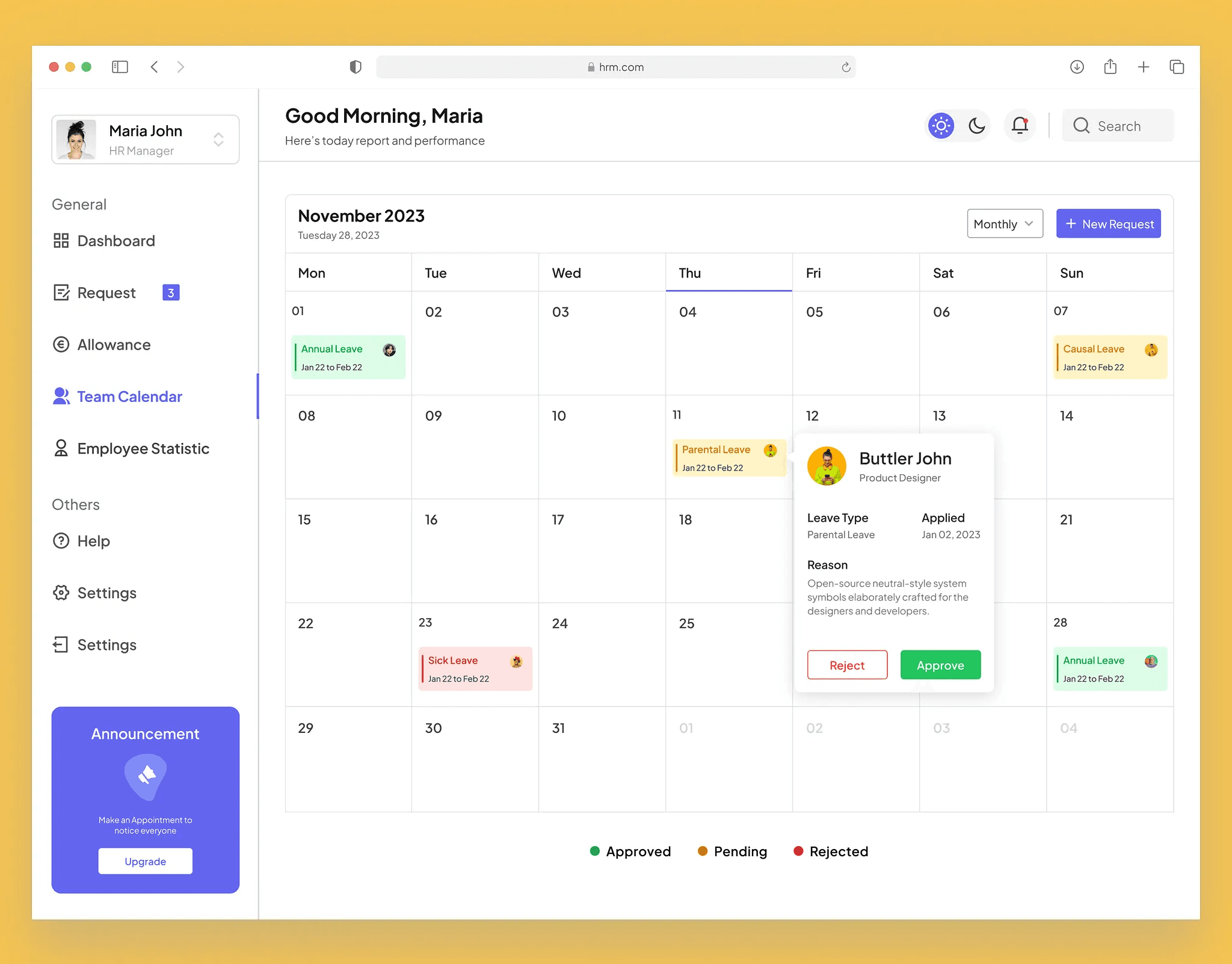
11 min read
Design systems that speed up engineering (not slow it down)
How to build a design system that reduces dev handoff friction, improves UI consistency, and scales with your product team.
Why most design systems stall
Design systems often fail when they are treated as a visual library instead of a shared contract between design and engineering. If component names do not match code, if states are missing, or if spacing tokens are inconsistent, engineers rebuild everything from scratch. The system becomes shelfware while the product drifts visually sprint by sprint.
The stall usually starts with good intentions. A designer documents buttons and colors in Figma. Engineering ships features using ad hoc Tailwind classes. Six months later, there are three button styles in production and nobody knows which is canonical. Meetings about "alignment" replace actual alignment because the system was never wired into how work gets done.
Another common failure mode is premature comprehensiveness. Teams try to document every component before shipping anything. The design system project becomes a multi-quarter initiative with no user—engineers still need to ship the billing redesign this month. Without incremental adoption, momentum dies.
Ownership gaps kill systems too. When "the design system" belongs to everyone in theory and no one in practice, updates lag behind product needs. New patterns appear in feature branches and never migrate back to the library. Governance does not mean bureaucracy—it means someone checks incoming components against standards and publishes changelog entries engineers can trust.
Finally, systems stall when they ignore production constraints. A beautiful card component that requires custom animation libraries or non-standard DOM structures will be avoided by engineers who are measured on velocity. Effective design systems meet teams where they work: React components, CSS variables, documented props, and copy-paste examples that compile on the first try.
Build from production constraints
Start by auditing existing code and design files together—not in silos. List the components that already appear most often in production: buttons, inputs, selects, modals, tables, navigation bars, and toasts. Map Figma components to their code counterparts, note naming mismatches, and pick one source of truth for each pattern. Then define tokens that map one-to-one to CSS variables or theme files: color, spacing, radius, shadow, and typography scales.
Components must be specced with all interaction states: default, hover, focus, disabled, loading, and error. Include keyboard focus rings and screen reader labels in the definition, not as a late QA ticket. Accessibility is part of the contract. When engineers know exactly how a disabled primary button looks and behaves, they stop improvising gray versions that fail contrast checks.
Document responsive behavior explicitly. SaaS products are used on laptops during work hours and on tablets in meetings. Show how navigation collapses, how tables scroll or stack, and how modals behave on small viewports. Ambiguity here produces the most expensive kind of rework—after QA or, worse, after customer complaints.
Version the system alongside product releases. Treat breaking token changes like API changes: announce them, migrate consumers, and provide codemods or search-and-replace guides when possible. Engineers adopt systems they can upgrade without fear.
Building from constraints also means accepting what your stack does well. If you use Radix or Headless UI for primitives, wrap and theme them rather than reinventing focus traps. If your brand requires custom data visualization, document chart colors and axis styles separately from form components. The goal is predictability, not aesthetic novelty in every sprint.
Buttons, inputs, form fields, modals, tables, and navigation patterns cover the majority of UI surface area in most SaaS products. Document these first with usage guidelines and do/don't examples. Teams see velocity gains within the first sprint because engineers stop debating spacing and start shipping features.
For each high-reuse component, include anatomy diagrams, prop tables, and composition examples. Show a primary button alone, in a button group, inside a modal footer, and paired with a destructive secondary action. Engineers should recognize their upcoming ticket in the docs without scheduling a meeting.
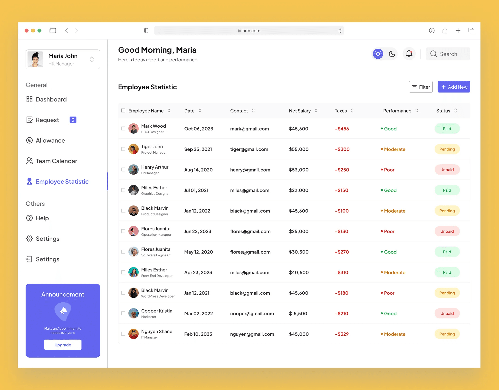
Tables deserve special attention in B2B SaaS. Spec sorting, filtering, pagination, empty states, loading skeletons, and row selection. Many products hack tables together per feature; a solid table pattern eliminates hundreds of inconsistent micro-decisions. Include guidance on numeric alignment, truncation, and inline actions so dashboards feel cohesive.
Forms are the other big win. Standardize label placement, helper text, validation timing, and error summary patterns. Onboarding flows, settings pages, and admin tools all inherit the same behavior. Users learn your product faster when the twelfth form behaves like the first.
Do not ignore empty and error states—they are where SaaS products often look unfinished. Document illustrated empties, retry actions, and permission-denied views using the same components as happy paths. Engineers frequently skip these unless the system makes them easy.
After the top ten components ship, measure reuse. Track how many new screens import library components versus custom markup. If reuse is low, the problem is usually discoverability or fit, not engineer motivation. Fix naming, add Storybook or Ladle entries, and pair with a designer office hour until adoption sticks.
Make handoff boring—in a good way
The best handoff is predictable. Designers deliver frames linked to component instances, not detached overrides. They annotate deviations with reasons: a one-off marketing layout, an experiment, a legacy screen scheduled for migration. Engineers receive a checklist: component name, variant props, token references, and breakpoint notes. No treasure hunts through nested groups.
Use the same vocabulary in Figma and code. If the React export is Button variant="primary" size="md", the Figma component should say Primary / Medium—not "CTA blue 2." Mismatched names feel trivial until you multiply them by two hundred files.
Provide copy specs and content guidelines alongside UI. Button labels, error messages, and empty state headlines should not be invented independently in pull requests. A short voice-and-tone doc plus message templates speeds implementation and keeps the product feeling authored rather than assembled.
Developers need runnable examples more than PDF exports. Storybook stories, internal documentation sites, or even an /examples route in the app beats static screenshots. When an engineer can fork an existing story to start a feature, handoff friction drops dramatically.
Define a clear path for new components. When a feature truly needs a new pattern, designers propose it with usage rationale. Engineering reviews for accessibility and performance. Once approved, it enters the library with tests and docs. Ad hoc components stay rare because the process is faster than fighting the system—and because the system is actually maintained.
Governance without bureaucracy
Lightweight governance beats heavyweight committees. A monthly design system review, a public changelog, and a clear proposal template are enough for most startups. Review incoming components, deprecations, and token changes. Publish decisions where designers and engineers already look: Slack, Notion, or the docs site homepage.
Assign a rotating "system steward" from design and engineering each sprint. Stewards answer questions, review PRs that touch core components, and keep the backlog of drift tickets visible. Rotation spreads knowledge and prevents burnout on one hero maintainer.
Measure drift actively. Run periodic UI audits comparing production to Figma. Screenshot diffs or tools like Chromatic help. Drift is inevitable; unmanaged drift erodes trust in the system. File small tickets to reconcile differences instead of waiting for a mythical "system sprint."
Deprecate with empathy. Give teams a migration window, codemods when possible, and office hours for questions. Hard cuts without notice teach people to fork components privately—the opposite of what you want.
Celebrate wins publicly. When a team ships a feature using only library components in half the usual time, share that story. Adoption follows usefulness plus social proof, not mandates from leadership alone.
Early-stage teams need a thin system; growth-stage teams need modular depth. Plan for layers: tokens at the bottom, primitives next, composed patterns above, and page templates for common SaaS surfaces like settings, billing, and admin lists. Not every layer must exist on day one—build the next layer when two teams ask for the same thing in the same quarter.
Multi-product companies should separate brand tokens from product-specific extensions. Core spacing and accessibility rules stay shared; marketing may need expressive layouts product settings do not. Document which layers are stable APIs versus experimental playgrounds.
Hiring accelerates when the system is good. New designers onboard by assembling screens from documented patterns. New engineers ship their first ticket by copying an adjacent feature's structure. Bad systems hide knowledge in senior teammates' heads; good systems shorten ramp time measurably.
Connect the system to quality gates lightly. Lint rules for disallowed hex colors, PR templates that ask "uses design system components?", and visual regression on key stories catch regressions without blocking velocity. The aim is feedback, not friction.
Partnering with a studio during a growth inflection can jump-start this work. Mool Studio often helps SaaS teams audit UI drift and stand up a pragmatic token and component layer engineers will actually use—not a poster on the wall. The payoff shows up in sprint velocity, not slide decks.
Token architecture that engineers trust
Tokens are the API of your visual language. When color, spacing, typography, and elevation tokens map one-to-one to CSS variables or theme objects, engineers stop hardcoding hex values in feature branches. Start with semantic tokens—text-primary, surface-muted, border-subtle—not only raw palette names like blue-500. Semantic names survive brand refreshes because components reference meaning, not specific hues.
Document token tiers explicitly. Global tokens define primitives; alias tokens map semantics for light and dark modes; component tokens capture exceptions like button padding or input height. Not every team needs three tiers on day one, but planning the ladder prevents renaming chaos when dark mode arrives month six.
Spacing scales should follow a consistent rhythm—often a modified 4px or 8px base—with names engineers recognize in code reviews. When designers use 13px ad hoc gaps because "it looked better," the system erodes. Publish allowed spacing steps and when to use each.
Typography tokens include font family stacks, size steps, line heights, and letter spacing for headings versus body. SaaS products drown in one-off font sizes when tables, labels, and helper text lack rules. Spec type roles: display, title, body, caption, mono—each with defined usage.
Elevation and shadow tokens matter for modals, dropdowns, and sticky headers. Engineers should not guess z-index stacks per feature. Provide layered shadow tokens and a z-index scale documented alongside.
Review token pull requests like API changes. Breaking renames require migration notes. When engineers trust token stability, they adopt the system faster because refactoring feels safe.
Measuring design system ROI on sprint velocity
Track metrics that connect the system to delivery speed, not only consistency scores. Useful indicators include percentage of new UI built from library components, average time to implement a standard form page, number of design-related QA bugs per sprint, and hours spent in handoff clarification meetings. Baseline these before major system investment, then compare after six to eight weeks of adoption.
Qualitative signals matter too. Engineers volunteering to use Storybook stories as starting points, designers refusing to detach overrides because migration is easy, and PMs referencing component names in tickets—all indicate healthy adoption. Conversely, repeated "just this once" custom buttons signal fit or governance problems.
Calculate ROI conservatively. If a system saves each engineer four hours per sprint on layout debates and state guessing, multiply by team size and sprint count. Compare against system maintenance cost—usually one rotating steward hour per week plus occasional audits. Most startups see payback within two sprints when adoption is real.
Avoid measuring only component count. A library with eighty unused components is vanity. Measure reuse on shipped features touching users. Tie system roadmap to product roadmap: when billing ships, table and pricing components get hardened; when mobile usage rises, responsive navigation patterns upgrade.
Share ROI stories internally. When the billing team ships in five days using shared forms and modals, broadcast it. Adoption spreads when engineering leadership sees velocity gains, not when design mandates compliance without proof.
Dark mode requests arrive early now—users expect theme toggles in SaaS settings even at MVP stage. Plan semantic tokens from day one so light and dark themes share component structures. Components reference text-primary and surface-default, not hardcoded #FFFFFF backgrounds that break when themes switch.
Document focus states and contrast ratios for both themes before launch. Dark mode with low-contrast gray text is a common accessibility failure when teams rush toggles without QA.
Engineering implementation paths include CSS variables, Tailwind dark variants, or theme providers in component libraries. Designers should inspect both themes in Figma using variable modes, not duplicate entire files per theme unless necessary.
Roll out dark mode on core components first—navigation, forms, tables—before marketing pages. Partial dark mode feels broken; communicate clearly if v1 ships light-only with dark coming soon.
Theming also supports white-label or enterprise customer branding later. Token architecture that supports dark mode often supports tenant-specific accent colors with modest extra work—future-proofing without building multi-tenant UI prematurely.